Chiaroscuro: a toned paper drawing from a photo
A drawing on toned paper, like an old master study in chalk: your pen draws the tones darker than the paper, a white gel pen the tones lighter than it, and the paper itself is every tone in between. Lines follow the form, and plain skies and backdrops get only calm, widely spaced lines. Suits portraits, busts and pets; dark photos go on black paper with white only. Built on evenly spaced streamlines.
Good for portraits and busts on grey or black paper.
Controls
- Paper · The colour of the paper you plot on. Tones close to it stay bare paper; darker tones get your pen, lighter tones the light pen.
- Spacing in the deepest tones · Line spacing in the darkest shadows and the brightest lights. Pens wider than 0.4 mm space their lines wider, so the tones hold.
- Spacing near the paper tone · Line spacing where the picture is only a little darker or lighter than the paper.
- Black or white · Moves the tone the paper stands for. Raise it for more white and less black; lower it for more black and less white.
More controls
- Light pen · The opaque pen for the lights. It plots last, so it sits on top.
- Light pen width · Line width of the light pen. Gel pens draw wider lines than fineliners.
- Light pen on plain areas · The most white a bright area with no detail gets, like a plain sky or backdrop: calm, widely spaced lines. Lower it to leave plain areas as paper; at 100% they get all the white their tone asks for.
- Leave tones near the paper blank · Tones this close to the paper stay bare paper on both sides. Raise it for a calmer drawing with more paper showing.
- Flow smoothness · How smoothly the lines follow the picture. Higher gives calmer, longer strokes.
- Tone curve · Bends the dark tones before drawing. Above 1 saves your pen for the deepest shadows; below 1 lets it reach towards the paper tone.
- Light tone curve · Bends the light tones before drawing. Above 1 saves the light pen for the brightest highlights; below 1 lets it reach towards the paper tone.
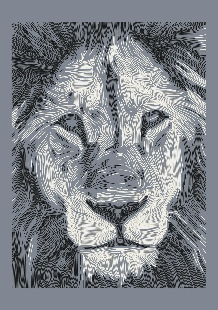

A dark pen, a light pen and the paper in between
Chiaroscuro plans a drawing for toned paper, like an old master study in black and white chalk. The paper stands for every tone close to its own. Your pen draws the tones darker than the paper, and an opaque light pen, such as a white gel pen, draws the tones lighter than it. Both pens follow the same form, and their lines sit closer together the further a tone is from the paper. Plain skies and backdrops get only calm, widely spaced white lines.
Paper sets the colour you plot on: Grey, Blue-grey, Tan or Black. Black or white moves the tone the paper stands for, towards more white or more black. Very dark photos start on black paper, where only the light pen draws; on the samples, that puts the Roman bust on black and the lion on grey.
Paper and pens are starting points
The paper colours stand for typical grey, blue-grey, tan and black card; they are not measured from real sheets. The white is an assumed gel pen tone, not a measured one. Real paper and ink vary, so plot a small test on your own paper first, and move Black or white until the paper tone looks right.
The light pen plots last, so it sits on top of the dark lines. Gel pens draw wider lines than fineliners, so set Light pen width to your pen; it starts at 0.4 mm. The SVG has one layer per pen, and the paper itself isn’t drawn in it.
Plot time
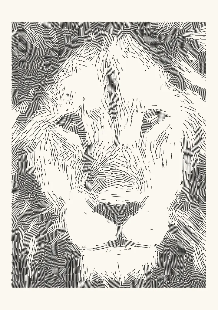
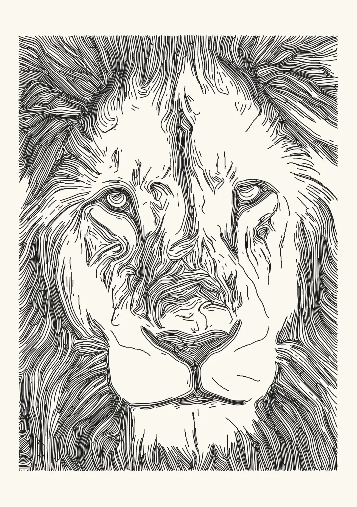
The lion test render on grey paper is 1,907 paths, about 24 minutes to plot: the black lines first, then the white. Portraits, busts and pets with clear light and shade suit it best.