Rings: concentric circle art from a photo
Calm rings that spread out from a centre and crowd together where the picture is dark, like ripples slowed by the shadows, breaking where the picture is light. Suits quiet, graphic portraits.
Good for calm rings that crowd into the shadows.
Controls
- Ring spacing in lights · Distance between rings in the lightest areas that still get rings, for a 0.3 mm pen. They crowd closer where the picture is darker, down to about a pen width apart in black. A wider pen spaces its lightest rings further apart, so the lights stay light.
- Keep highlights blank · Anything less dark than this stays blank paper. Raise it to keep highlights clean.
More controls
- Centre across · Where the rings start, from the left edge of the picture to the right. Put it on the subject so the bullseye doesn't pull the eye away.
- Centre down · Where the rings start, from the top of the picture to the bottom.
- Tone curve · Bends the tones before drawing. Above 1 lightens the mid-tones, which helps when a pen pools ink; below 1 darkens them.
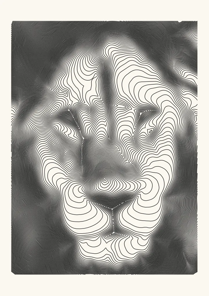

Rings that crowd into the shadows
Rings spreads smooth rings out from a centre, like ripples on water that slow down in the dark parts of the photo. Where the photo is dark the rings bunch up, down to about a pen width apart in black; where it is light they spread out, and past Keep highlights blank they stop, so the highlights stay paper. On an even background the rings are near-perfect circles, and around a face or a shape they bend to follow it. Ring spacing in lights sets how far apart the lightest rings are, and Centre across and Centre down move the middle onto the subject.
Rings or Spiral?
Rings draws no wave: tone comes from how close the rings sit, so it looks calmer and more graphic than Spiral, whose one long line wobbles harder in the dark. Rings breaks into separate pieces wherever the photo goes light, so it lifts the pen more often; the spiral is one long line with very few lifts.