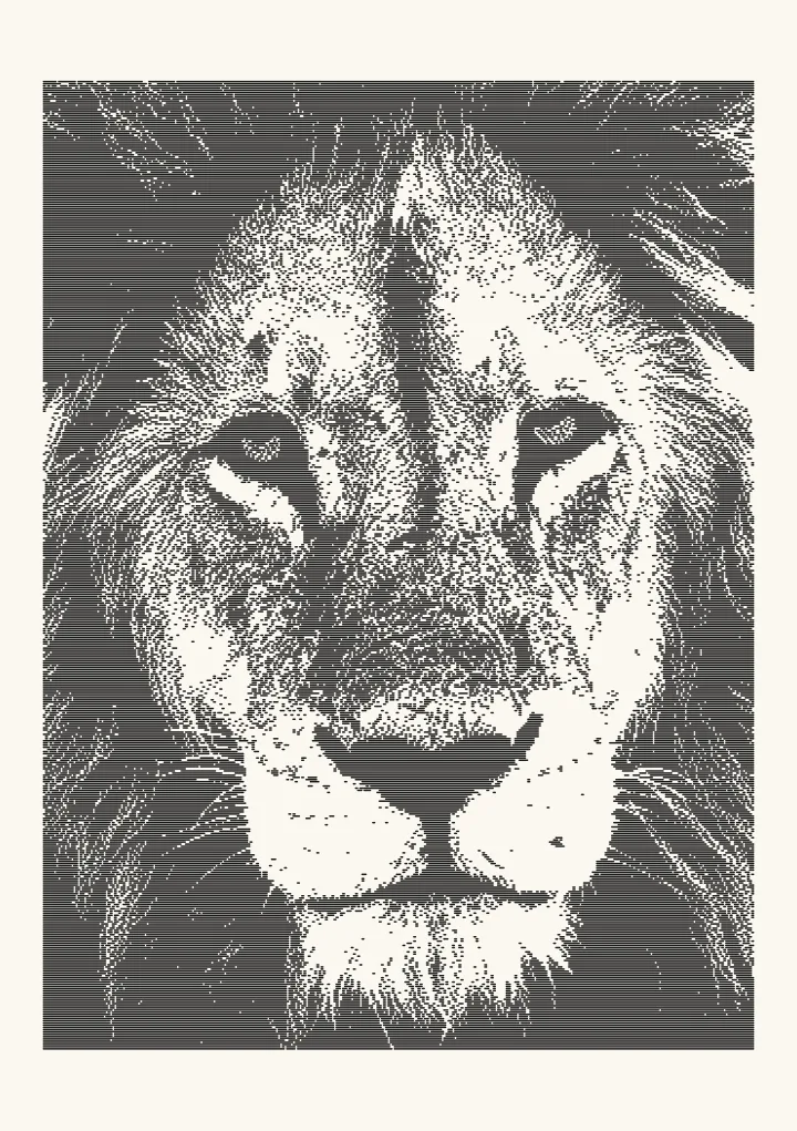
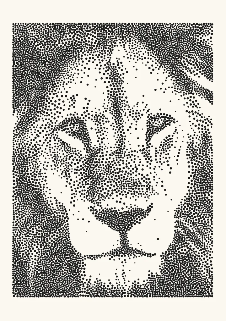
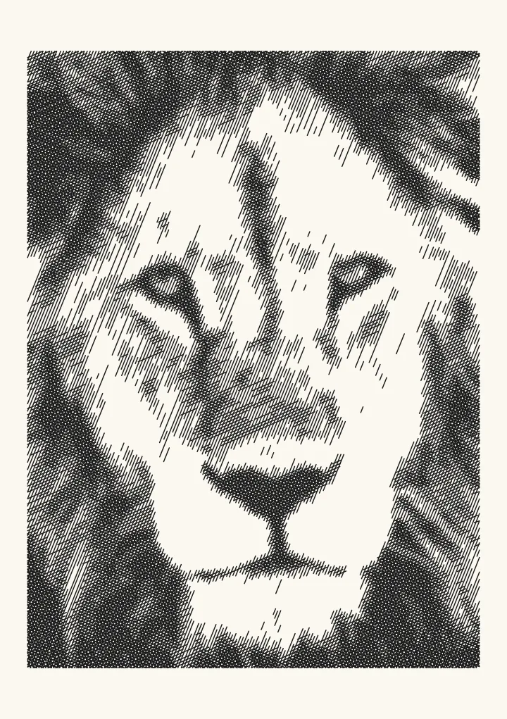
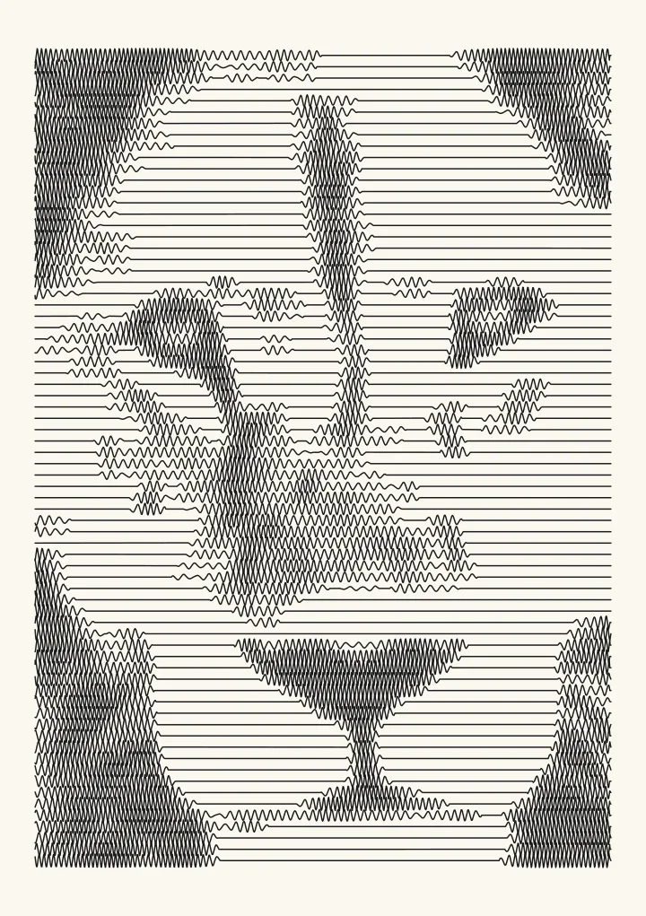
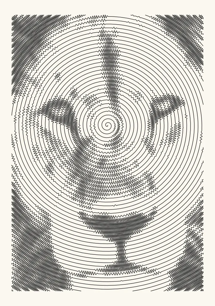
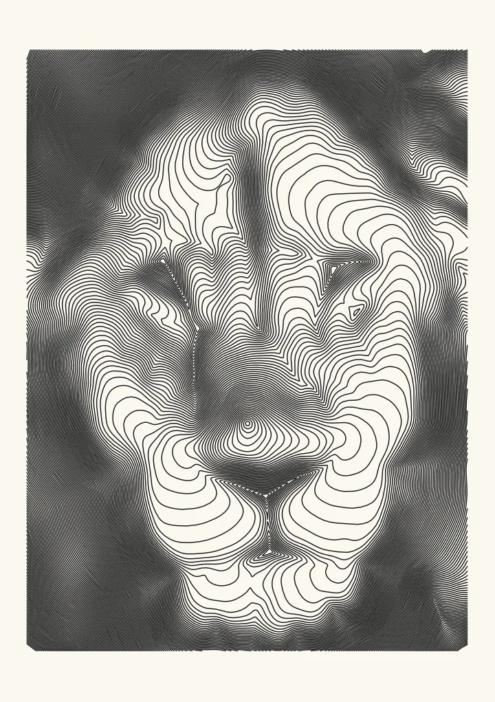
Words: a text portrait from a photo, in your own words
The picture written in your own words, in straight rows of single-stroke letters: close rows in the shadows, fewer and looser rows in the lights, and blank paper in the highlights. Suits bold shapes against a plain ground, written in a letter, a poem, song lyrics or a whole chapter, repeated to fill the picture or written once, in order.
Good for a bold silhouette written in your own words.
Controls
- Text · The words the picture is written in, in the order you type them. Line breaks become spaces.
- Use the text · Repeat to fill runs the text on and on, with a dot between repeats. Whole text once writes every word exactly once and sizes the letters so all of it fits.
- Smallest letters · Height of the capitals. Whole text once makes them bigger when the text is short, and a higher Size range makes them bigger in the lights. Letters never go below four pen widths: 1.2 mm with a 0.3 mm pen, 2 mm with a 0.5 mm pen. If the text does not fit, the drawing says how much was left out.
- Keep highlights blank · Anything less dark than this stays blank paper. Raise it to keep highlights clean.
More controls
- Size range · How many rows of the smallest letters one row of the largest spans. 1 keeps every letter the same size.
- Bolder letters in the darkest areas · Where even the tightest rows are too light, every stroke is drawn twice, slightly offset. Off draws lighter and plots much faster.
- Tone curve · Bends the tones before drawing. Above 1 lightens the mid-tones, which helps when a pen pools ink; below 1 darkens them.
A picture written in your words
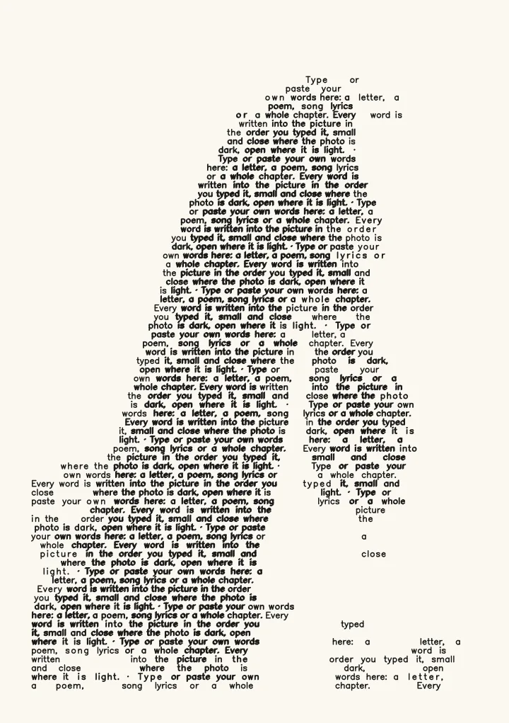
Words writes the picture in the words you type or paste, such as a letter, a poem, song lyrics or a whole chapter. They go in straight rows of single-stroke letters, left to right and row by row in the order you typed them, and no word is ever split. Tone comes from how much is written. Where the photo is dark every row is written; in the mid-tones every second row, with the letters spaced a little further apart; and past Keep highlights blank nothing, so the lit parts of the picture stay paper. Where even the tightest rows are too light, a stretch of words is drawn bold, every stroke twice and slightly offset. Up close it reads as text, and from arm’s length as the photo, like micrography, a picture made of tiny writing.
Size range lets words in the lights grow into the empty rows above them; at 1, the default, every letter is the same size. Line breaks in your text become spaces. The font writes accented letters such as é and ï, and writes Greek and Cyrillic in Latin letters, so Москва becomes Moskva. Chinese, Japanese, Korean, Arabic, Hebrew and emoji come out as “?”, and the drawing says which.
Repeat to fill, or the whole text once
Use the text decides how your words fill the picture. Repeat to fill, the default, runs the text on and on with a dot between repeats, so a name, a line or a short poem covers the whole picture. Whole text once writes every word exactly once and sizes the letters so all of it fits: a short text gets bigger letters, and a long one stays at the smallest letters and stops at the last word that fits.
When the words don’t all fit, the drawing says how many did and what would help: larger paper, smaller letters or a finer pen, or a shorter text. Repeat to fill says the same when a long text never gets as far as repeating.
How much text fits at a readable size
Letters never go below four pen widths, so the eye of an e stays open: capitals 1.2 mm tall with a 0.3 mm pen, and 2 mm with a 0.5 mm pen. Only the darker parts of a photo are written, so how much fits at that size depends on how much of the photo is dark. Written once on A5 with 8 mm margins and a 0.3 mm pen, the first chapter of Moby-Dick (2,193 words) fits 449 words on the pale tabby cat, 838 on the lion and 2,180 on the dark peacock feather. With a 0.5 mm pen, the lion holds 283 of them.
The Roman bust is a wide photo, so the editor starts it on a landscape page. There the chapter fits 1,970 words on A5 with a 0.3 mm pen and 684 with a 0.5 mm pen. Landscape A4 holds every word with the 0.3 mm pen, in about 160 minutes of plotting, and 1,503 words with the 0.5 mm pen. To write the whole chapter once on landscape A5, use a finer pen: with a 0.25 mm pen and Smallest letters at 1 mm, all 2,193 words fit, in about 140 minutes. On portrait A5 the bust’s picture is smaller and holds 867 words with the 0.3 mm pen and 296 with the 0.5 mm pen.
Plot time: mostly pen lifts
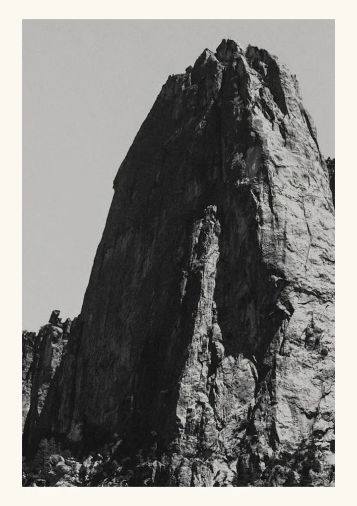
Every letter is a few separate strokes, and every stroke means lifting the pen, moving it and putting it down again. The test render above, the mountain peak on A5, is 4,485 paths, about 42 minutes to plot, and about 18 of those minutes are the pen going up and down, at 0.12 seconds each way in the editor’s estimate. Moving the raised pen takes about 5 more, and drawing the letters about 19.
Turning off Bolder letters in the darkest areas draws lighter and quicker: the same drawing takes about 28 minutes. A 0.5 mm pen writes bigger letters and fewer of them: 2,961 paths, also about 28 minutes. The editor’s sample lion is taller than it is wide, so the editor starts it on a portrait page: A4, or US Letter in the US, Canada and Mexico, with 15 mm margins and a 0.35 mm pen. Its picture is bigger there: about 73 minutes to plot on A4 and about 71 on US Letter, about 38 of them pen lifts on A4 and about 37 on US Letter. The path count and plot time there follow your own photo, paper and text as you change them.
Photos that suit it
Words is at its best on a dark ground with strong light. On the sample photos, the Roman bust and the dandelion come out as bold silhouettes: the dark ground fills with even rows of text and the lit subject stays paper, with a few words in its shadows. A strong shape against a plain sky, like the mountain peak above, reads well too: the sky stays paper, the lit rock is written in looser rows and the shadowed ridges in bold. A photo of mid-greys like the lion reads more faintly: its dark mane fills with close rows and the nose and mouth show as a darker patch, but the grey fur of the face comes out as loose, broken rows. Pale, soft photos such as the tabby cat and the matryoshka dolls come out as scattered words, and a busy dark photo with fine light detail, like the peacock feather, turns into an even block of text that takes about 137 minutes to plot.